LOGO-A-GOGO: BRANDING POP CULTURE / AUTHOR: RIAN HUGHES / PUBLISHER: KORERO PRESS / RELEASE DATE: OUT NOW
We often take graphic art for granted. Whenever you’re flicking through the latest issue of STARBURST, you may not realise how many hours have gone into designing the pages and sorting the layout. The name Rian Hughes may not mean much to you, but you would have certainly seen his work. He has made a career out designing covers and artwork, and specifically in the case of this collection of logos and mastheads.
In a suitably lengthy introduction, Hughes explains how he got into the business and more importantly, what it is about fonts and logos that piqued his interest in the first place. It’s a passionate and very relatable tale of how someone managed to get one of the coolest – if unsung – jobs in the biz.
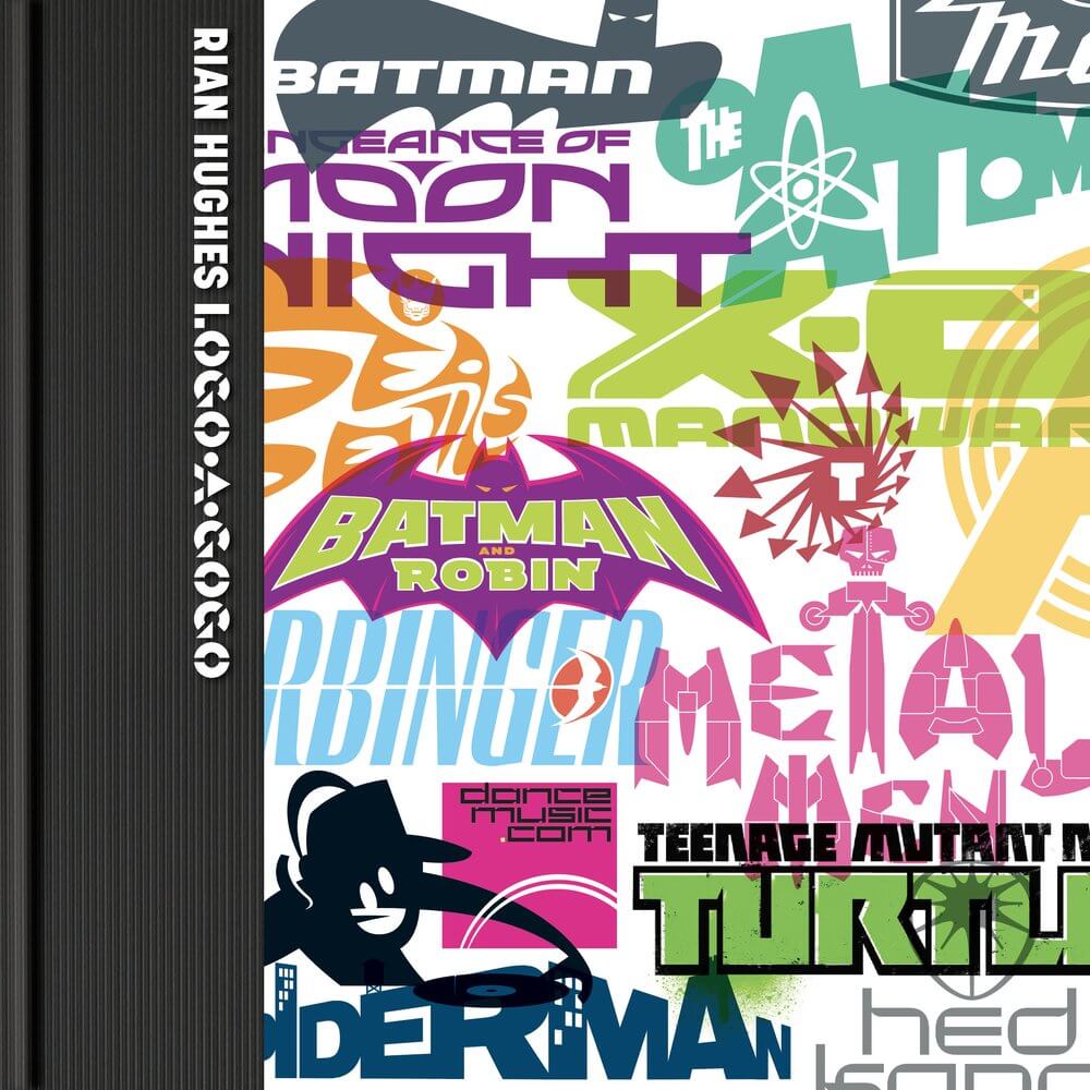
Getting to the nuts and bolts of the book, we have a selection of some of Hughes’ most famous work, as well as some surprising assignments he’s worked on. There’s a progression in the development in the mastheads for many of the most famous comics ever made. Particularly interesting is seeing Rian’s annotated version of the Marvel Comics logo, which although not picked up by the brand, was later adopted by the film studio arm and graces their output to this day. The attention to detail is amazing, and although it’s all described in a quick manner, it’s a unique insight into the designer’s eye. His work with both Marvel and DC (plus the indies) is scattered throughout the pages of the book and is equally impressive.
Likewise is the updating of the Fleetway logo. We all remember owning annuals published by the company, but when they were relaunched in the early ‘90s, at first glance we’d not recognise the logo. With Hughes’ commentary, we can appreciate where he was coming from with his very modern looking design.
With so much to take in, it’s a book that you’ll be always flicking through, admiring each and every page a little closer each time. You don’t have to be a fontologist or an old typesetter to appreciate it all, but those who do get off on cool letters and insignia will be salivating over this book.