
Review: Transfusion / Author: Steve Niles / Artist: Menton3 / Publisher: IDW Publishing / Release Date: Out Now
Bleak, futuristic worlds where vampires have become the only dominant survivors are already starting to become a bit of a cliché. After all, nothing could be bleaker than a being ruled by a bloodthirsty parasite, especially if the entire world has gone to rack and ruin. Transfusion adds the slight innovation of a world in which robots have destroyed everything, and of course, Matrix-style, the robots also need blood in order to operate.
Sadly, the concept is the strongest thing here. The world fails to be interesting because the creators have stripped out conflict along with hope. What should be a story about survival instead boils down to do factions of unlikeable monsters competing to be the biggest set of jerks, and this is neither interesting or entertaining. It’s engaging in an art for art’s sake sort of way, but doesn’t actually do anything, it’s as empty and hollow as the world it’s trying to portray.
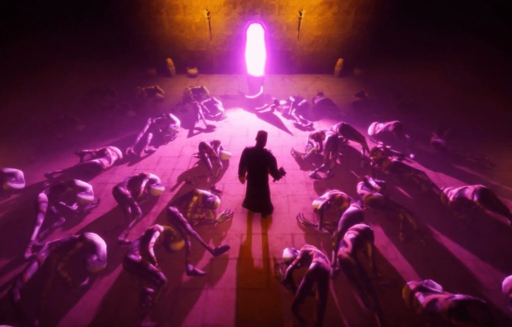
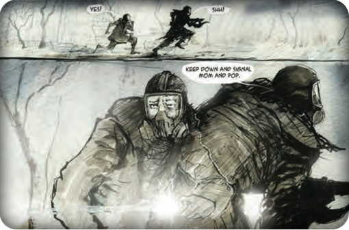
The artwork is also done in a bleak, Geiger-inspired style, mostly black with hints of shiny silver, and plenty of red. This echoes the story perfectly and there is a great fusion here. However, the same sort of imagery repeated for sixty-odd pages just becomes boring and bland. What should be a high concept, high art work is instead about as dull as looking through a series of heavy metal album covers; fun to begin with, then dull over time.
The saddest thing about Transfusion is not the story itself (though it desperately wants to evoke some sort of glum emotion from the reader), it’s the fact that all the talent that has gone into this has been wasted. Potentially this could have been a great bit of Gothic science fiction dystopia, instead what we have is just another vampire story. Still, if you’re looking for something that looks pretty to go on your shelf next to a pile of heavy metal tat, this may be for you.