Legendary poster artist GRAHAM HUMPHREYS talks horror, his long career, influences, the evils of Photoshop, and more!
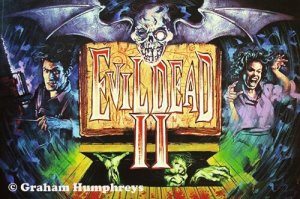
STARBURST: One of your most celebrated earliest works was the iconic UK theatrical poster for Sam Raimi’s The Evil Dead, a film which was soon to be dragged unfairly into the whole Video Nasty controversy. Do you think that the notoriety the film gained during this time helped or hindered your career?
Graham Humphreys: The Evil Dead got its UK distribution in 1983, two years before the Video Recordings Act came into law in September 1985. At the age of 23, two years seemed more like ten years at the time and I don’t recall any significant impact on my career during that period. This was for two main reasons, the first being that I was not particularly aware of most of the films that had become a target for the silly and hysterical tabloids, and thus oblivious to how their removal and savage editing might impact on choice or, indeed, the morality of an infantilised nation. Secondly, The Evil Dead had already been censored with a significant number of cuts for the theatrical, and therefore, simultaneous video, release. Mostly, these were simply to reduce the running time on particularly graphic scenes, although I think the eye gouging was almost entirely removed from the original version I’d been shown at a screening. So as far as I was aware, censorship was already in place for VHS. Of course I hadn’t really been introduced to the many European films and the rarely seen, contentious US art-house films that had begun to flood the shelves in the burgeoning VHS rental shops. As we know, many videos were pulled simply because of the titles themselves. It was enough that they sounded as if they might offend! My real introduction to, for instance, Argento and Fulci films came through Richard Stanley, whilst we storyboarded his first feature, Hardware. My film knowledge had been UK/US centric until that point, with the exception of televised European Cinema. If I had to identify any impact on my career, it will presumably have been positive. A Nightmare on Elm Street was released in the UK around the time of the Video Recordings Act coming into law. So if The Evil Dead gave me my first entry into horror marketing, Nightmare’ cemented my position within the genre. It’s important to add that the majority of my freelance work at the time did not fit into the genre category. In order to earn a living I was working on a whole raft of other illustration commissions, completely non-horror related. It’s only in the last ten years that I’ve been working almost exclusively in the genre.
It’s heartening to see that you’ve routinely revisited the Evil Dead franchise many times over your career, including the recently sold out vinyl reissue of the original’s score, The Evil Dead – A Nightmare Reimagined; is there anything in particular about that series that inspires you to keep returning?
In truth, it’s not my decision. I am reliant on being commissioned for any job. Although I rarely turn down work, and only do so because of deadline or budget issues, it is always a thrill to return to an earlier title that has been so formative in my career. As with most artists, I perceive only the weaknesses in my work and each chance to make amends is welcome! I have to work within the limits of my ability and experience, returning to a title like The Evil Dead gives me a chance to experiment with ideas and techniques that I didn’t have at the time. The soundtrack you mentioned is an interesting example because the art is not promoting the film as such but rather an appendage, albeit an important one. My personal challenge involved not simply creating a cover for the film, but using it as visual resource. I wanted to use the four panels of the gatefold as a picture book. The cover is thus a rather restrained image compared to the blood drenched final panel within. The discovery of the taped recording is not an explosive gore-filled scene, but the moment where the horror begins, thus Ash is still looking clean and fresh faced. The tape reel is a direct reference to my original poster. A film poster has to capture the essence of a film in a single panel. The gatefold LP format is four such ‘posters’, two double spreads, each a separate chapter. My second version of the Evil Dead 2 poster, the licensed screenprint, was another chance to create a poster from scratch, as if seeing the film for the first time, yet also acknowledging that which had gone before. I suspect I’ll be returning to the woods again!
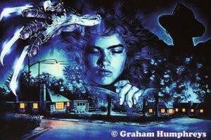
Speaking of that iconic Evil Dead 2 poster, how did it feel to see that piece so lovingly referenced by Edgar Wright and Simon Pegg in the debut season of Spaced?
I didn’t see the original run of Spaced, so was unaware of the poster’s use. In fact, I think I was only made aware whilst preparing some ultimately unused concepts for a Shaun of the Dead cinema poster. Naturally, it was a thrill to finally see the series and how the poster was featured so prominently. When Tim inadvertently recreates the pose on the poster, it reminded me of how I’d photographed a friend posing in the exact same way to provide my reference for the original painting! I used a lot of Polaroid photographs in the eighties. Whenever you see a hand in a piece of my artwork, it’s usually mine. Even in the recent Blu-ray cover for Arrow films Blood and Black Lace, that’s me dressed in black! I used a camera on a 10 second timer!
Moving away from Raimi’s franchise, which other genre properties have been favourites to work on?
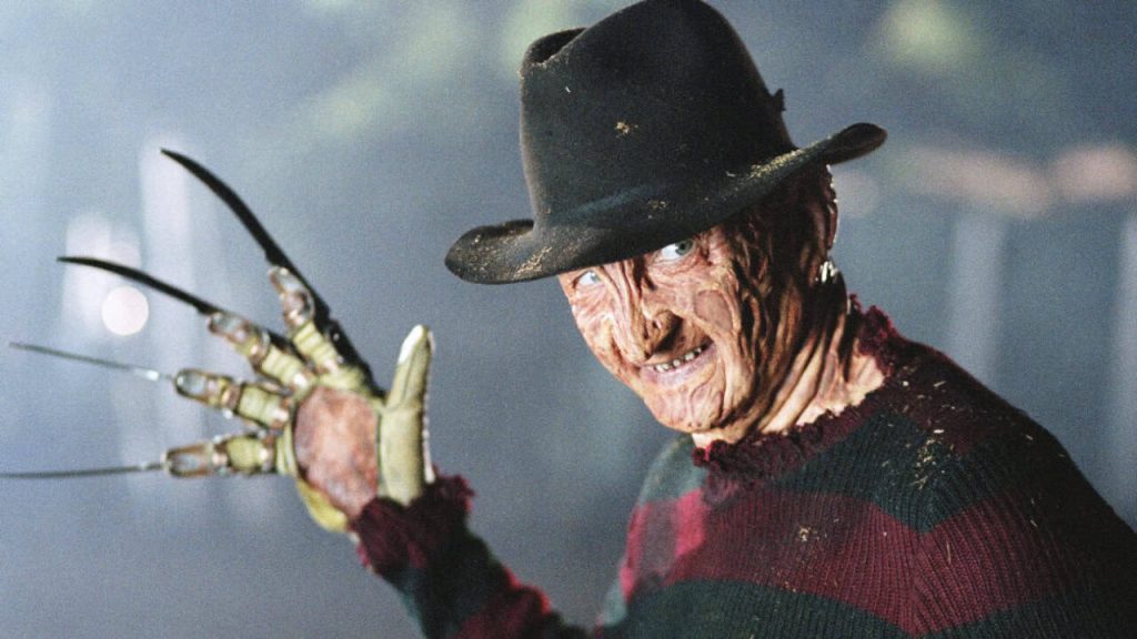
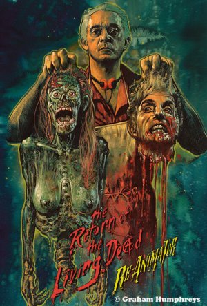
Aside from The Evil Dead, only A Nightmare on Elm Street provided a number of sequential commissions. I was a fan of the first film, after seeing a preview screening at London’s Scala Cinema. This was some months before being asked to illustrate the eventual UK poster campaign. I appreciated the risk Palace Pictures took by returning to my services. Nightmare’ was completely different to The Evil Dead and the last thing they required was the crude punk rock exploitation look of the 1983 artwork. Most clients pigeonhole artists’ work; I can’t imagine any other client would have had the foresight to make the decision. I then worked on each of the four sequels – the third was my work, though not an illustration – plus a number of Nightmare’ related jobs. Another film I’ve returned to – pun intended – is The Return of the Living Dead. I was unhappy with my original VHS cover, simply because I felt I didn’t have the skills to pull off what I’d intended – this despite the fact that people clearly liked the sleeve – so I recreated the art for a dedicated Blu-ray screening event, really as an experiment. Since then I’ve painted a book cover – Cult Screenings’ 245 Trioxin – and a Shout Factory US Blu-ray release. There was also a hybrid Re-Animator/Return of the Living Dead poster for the Cult Screenings Don Calfa event.
It’s probably safe to say that the vast majority of our readers miss the days of artwork posters and sleeves; why do you think that the studios and distributors moved away from the medium in the ’90s?
Easy answer – Photoshop! It wasn’t an available tool until then. Photocomposition was an expensive process prior to the ‘affordable’ introduction of the software. The skills involved in splicing large format transparencies, re-photographing them and retouching using bleaches and dyes to hide the joins, made it the work of highly skilled artists. Even the early version of computer ‘comping’ involved using specialised facilities, desktop computing was still unaffordable for most designers… the expense was enormous. But I realised very quickly that unlike the tradition of transparency retouching, new computer ‘comping was entirely technology-led and often lacked the artist’s eye. Unfortunately, this is still often the case. High definition has replaced suggestion. I also suspect that as film studios found their talent ever more demanding of obscenely large fees, the need to make full use of an expensive face took over from merely expressing the film’s subject matter. Photography took over. It is slightly disappointing that in a market awash with Photoshop portraiture, there is also a new visual illiteracy. The beautiful posters created by Saul Bass are a prime example of how film marketing moved away from his symbolism to a new literalism, becoming infantilised by Photoshop. As Quentin Tarantino observed, contemporary film posters look more like ‘Vogue covers’. Pouting, overpaid actors retouched in high definition. Painted images are a springboard of suggestion and imagination. A photograph, no matter how beautiful, is simply that.
Conversely, the rise of home video distributors specialising in cult & classic reissues like Arrow and Eureka has created a hunger for newly commissioned artwork. Do you feel that the trend may ever come full circle and return to the mainstream at all?
That’s doubtful. Illustrated images are mostly used for reissues, ancillary campaigns or independent films with limited distribution, but rarely first run releases. However, I think that’s fine. In many ways, there will always be more freedom of expression where the reductive, corporate needs of accountants, executives and moneyed interns are factored out. Modern film marketing is led by money people, not art directors. It may always have been a ‘business’, but it often seems there is little encouragement for true mavericks or creative outsiders right now. In the same way that major releases tend to be franchises, sequels or star vehicles, the campaigns are reflective of a homogenised business where risk is discouraged. But hey, never say never!
Which artists would you say have influenced your style and, or, career?
It’s a mix. I take inspiration wherever it arises. From my early childhood, visits to the local library – I was fascinated by religious depictions of demons and hell – all easily accessible images of horror! And of course, the Bible is full of gratuitously shocking imagery. I didn’t have a particularly religious upbringing, though like many of my generation, Sunday school was just one of those things that you went to as routine. The promise of Sunday school outings to the coast was the biggest draw. It’s curious to look back and see that I was ‘confirmed’ as a Christian in my early teens – before I really understood the contexts and realities of ‘faith’. I’m now atheist. As an amusing aside, my nose bled during the confirmation! I also served at the altar in the local church. I consider it an induction into the world of ‘gothic’! I then found myself becoming aware of book covers and film posters; the magical touchstone for many was Dennis Gifford’s A Pictorial History of Horror Movies. Tom Chantrell’s cover was easily the biggest catalyst for everything that followed. Some film posters stood out more than others, but many of the US posters seemed to be painted by jobbing artists with their own specialist areas – US civil war, cowboys, landscapes – and quite how they ended up providing some of the most memorable ‘disaster movie’ posters is something I’ve always thought was rather odd. I’ve named Chantrell, but in the UK, Vic Fair created some amazing work. From the US – Drew Struzan, Bob Peak, Richard Amsel and J.C. Leyendecker. The printed posters of Jules Cheret, Toulouse Lautrec and Alphonse Mucha. The new generation of British illustrators that emerged during my college years. The work of Saul Bass and graphic artists too numerous to catalogue… Sometimes it might only be one particular piece of work from an individual’s entire output. But I also take inspiration from the abstract and tribal… and a particular love of Tibetan sacred art.
Many of our readers, and writers for that matter, will have grown up with at least one of your movie posters tacked to their bedroom walls; who or what adorned yours?
I should have added both Bruce Pennington and Roger Dean to that last answer. They both adorned mine! Now it’s almost all vintage posters – the Universal monster films, Corman’s Poe films and many of the Hammer Horror – there seems to be a lot of Christopher Lee and Vincent Price! But yes, back then I had a copy of Jaws, Earthquake and The Hindenburg as my first collected film posters.
How long would you say on average commission takes to complete?
Depending on the complexity, a painting might take anywhere between two and four days, maximum five. The fee often decides what time you can allow. If I spent two weeks on a job that was only covering the fee of one day, I’d be out of business pretty fast. The preliminary process – viewing a film, making grabs, the sketching etc. – can often be completed in a day. This time is generally not covered in the fee; I tend to quote on the painting process!
A studio or distributor gets in touch – can you walk us through the process of creating a piece?
It’s often been different in the past, but the process has been whittled down to a fairly simple set of stages. 1) The initial contact and acceptance of a job – once a budget and deadline has been mutually agreed. 2) Viewing the film, or materials, to get a measure of the subject and an understanding of how best to approach the project – the client will usually indicate upfront any particular requests… ie. required imagery or portraiture. 3) Selecting the imagery I feel works best, usually screen grabs, and sketching the various elements – portraiture is almost always traced from the photographic source using printouts – it’s the most efficient way of ensuring a likeness. Sometimes I’ll supplement the images with my own photography and web searches, or composite the grabs with other poses, or perhaps add a close-up to a wider body shot, to keep the best portrait reference. 4) Scan the pencil sketch elements into Photoshop and play around with compositions, exploring focal elements or key ‘moments’, always searching for the most impactful or meaningful combinations. 5) Email the layouts to the client and – all being well – agree on the preferred option. 6) Reintroduce the original photographic sources over my pencil layout, creating a crude photo-comp in Photoshop. 7) Print out the comp to the size I intend to paint. 8) Trace onto the paper – I generally use Bockingford 190gsm, ‘not’ surface – a pitted effect that allows for more texture when painting. 9) Use masking tape to secure the paper to a wooden board I use for the purpose. 10) Cover the paper surface in a wash of colours that will form the base of my colour theme, using splashes of additional colour or clear water to particular areas – always having a rough version of the finished item in my head. 11) During the previous process, the paper will buckle, forming ‘valleys’ where the paint will run into shapes and forms that will add a spontaneous look – the paper dries flat because of the taped edges – so once dry I’ll usually start by defining the darkest areas, the basic shadows and contours, almost a drawing rather than a painted image. 12) Then I’ll concentrate on the key portraiture, moving around the painting, most often from top left to bottom right, so as not to disturb the painted surface resting my hand as I paint, or using bits of clean paper to protect the surface. 13) Take constant breaks to keep reviewing with fresh eyes… one of the most important devices I also use, a piece of mirror that I constantly check the progress with. It has a two-fold purpose: to see the reflected painting as if for the first time, but also to keep in check the tendency to skew imagery. If you’re right-handed it’s easy to find a bias of angles from bottom left to top right, and in reverse if left-handed. Using a mirror to check this will quickly reveal the bias. 14) Complete the painting by ensuring important detail is included, portraits are as good as the paint will allow, and that there is a cohesion and balance to the overall layout. The addition of a few carefully administered splatters using a worn brush is the final stage. 15) A quick photo is often taken for the client to see the results and identify any glaring issues. Fortunately, these are rare. Then the final scan and any necessary final tweaks in Photoshop, usually adding a bit more extra bleed, but generally retaining the integrity of the original item. 16) Invoice and get paid!
It’s probably akin to picking a favourite child, but which piece are you most proud of?
Once a job is complete I tend to dislike it – it’s part of the natural process where you keep re-evaluating what you do, always striving to improve. Of course budgets and deadlines conspire against ideal results. For this reason it might take a year or two for me to regard a job as something I can feel comfortable with. I’m always trying to look through the eyes of a stranger, judging my work and finding fault… it’s the only way to move forward! So I can’t really identify favourites, just successes. My easy copout is always the same… the job I’m most proud of? I’ve not painted it yet!
If fans want to get their hands on your work, where can they point their wallets?
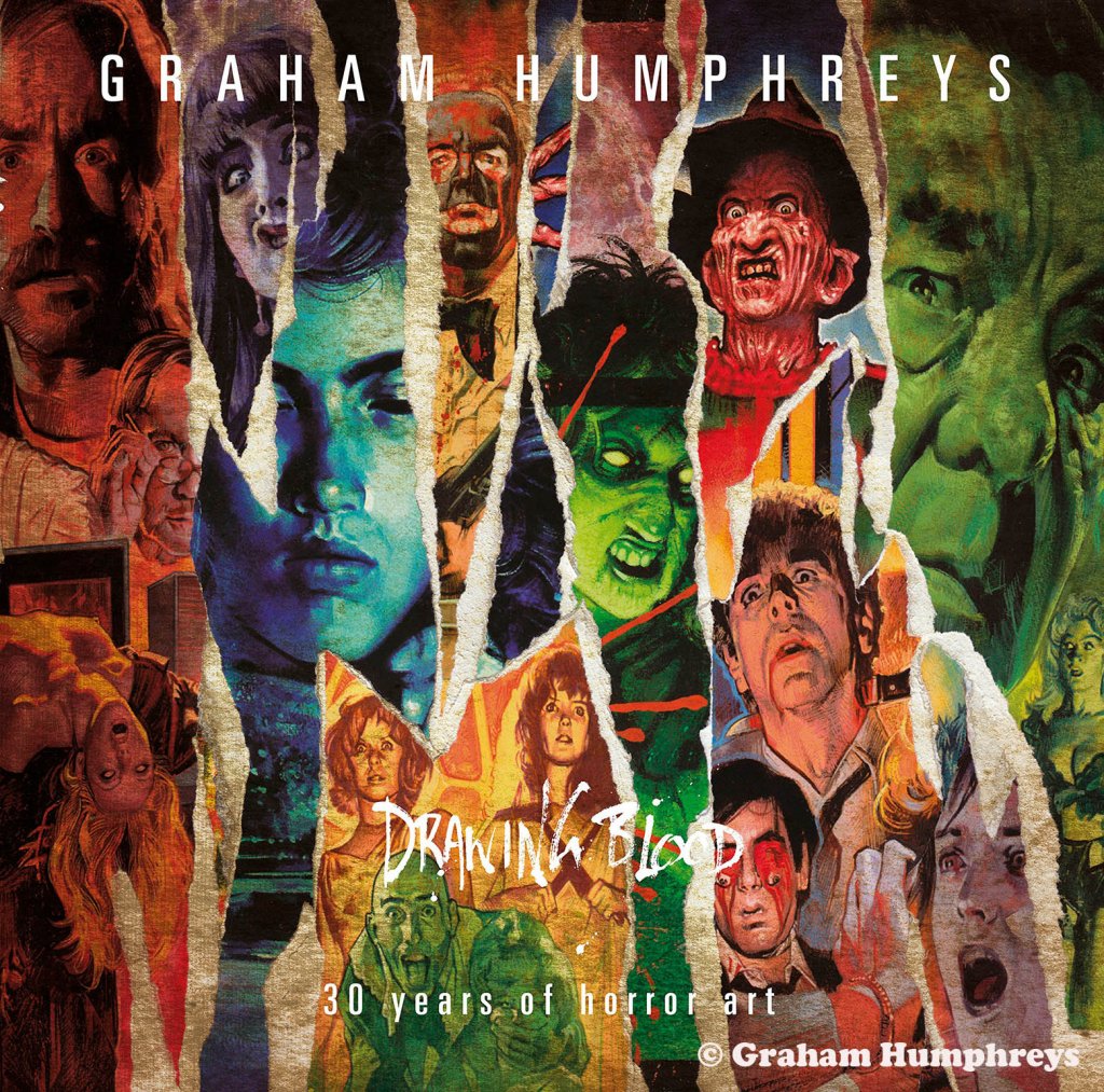
The best place they can spend that money is on the final product – Blu-ray, LP or whatever – that way I’m more likely to be recommissioned by the client! However, my website has a section which shows what folio prints are currently available. There is no online shop, but my email address is easily found on the site and I can respond with prices etc. Very easy! The large format book Drawing Blood, published by Proud Gallery, is still available, though I have no access to stock. The gallery – proudonline.co.uk – will sell you one, as will Amazon. It’s a bit pricey – sorry, out of my control – but it comes in a special box and with a limited edition giclée print. People seem to like it! And any convention where I’m a guest, I’ll always have prints, booklets and posters. As my work is paint on paper, rather than digital, I have originals that I’m also happy to sell. Prices are set according to the amount of work and subject matter.
Are you able to tell us about any upcoming projects that our readers should be excited about?
Not without compromising the confidentiality of the client! But there are some fun items I’m currently very excited about personally. Perhaps a favourite film, a favourite TV series… I’ll say no more!
For more on Graham Humphreys’ incredible work, be sure to visit www.grahamhumphreys.com. To contact about prices and/or commissions, reach out using [email protected]